Features at a glance.
Four views of one dataset: what they show, what they rest on and the decision each one supports.
Market Overview
In both plansA market at a glance, month by month.
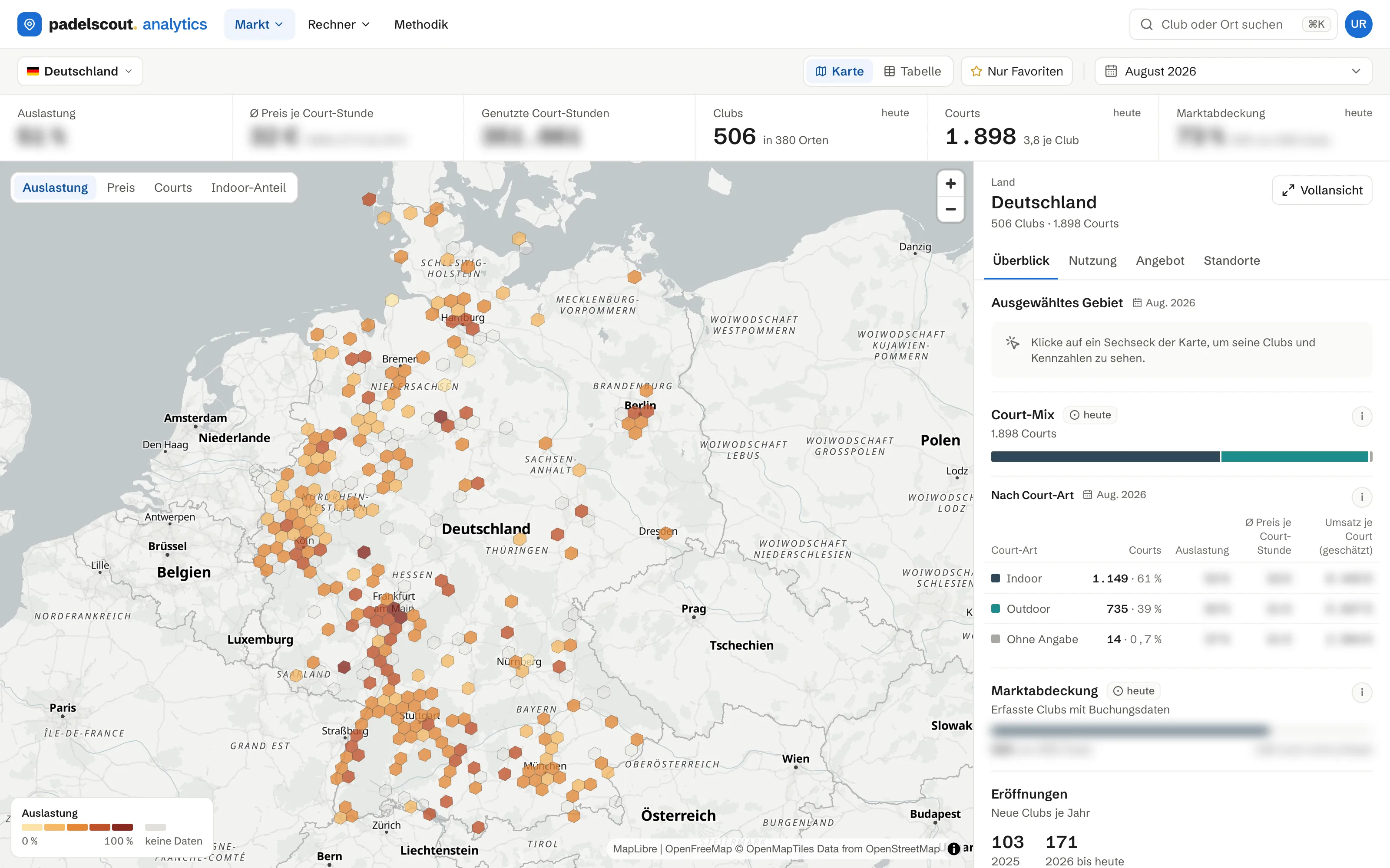
One page per market: how much supply there is, how busy it is and how completely we track it. The map shows utilization per area; click a hex to see its clubs. You pick the country and the month at the top of the page.
- Utilization, average price per court-hour and court-hours in use for each month
- Utilization per area on the map, with the clubs in every hex
- When people play: weekday and hour, prime time and weekends
- Supply and coverage: club sizes, booking platforms, court mix and openings per year
Underlying data: Supply and coverage describe the market as it stands today. Rates include only clubs whose courts we observed on at least half of the days of the chosen month. Coverage compares the tracked base with every padel venue we know of in the market.
Locations
In both plansEvery metro area in detail.
Between country and club sits the metro area. The ranking puts every region of a market side by side, and the region report opens one of them in detail.
- Ranking of all regions by supply, utilization and coverage
- Region report with key figures and peak hours
- Every tracked club in the region with its figures
- Average price per court-hour and market coverage per region
Underlying data: Regions are the assigned metro areas. Coverage per region is stated against every club we know of there and does not depend on the month shown. Figures come exclusively from the tracked clubs.
The regional view, hands on: the free Berlin report shows this analysis for a real market.
View the Berlin padel market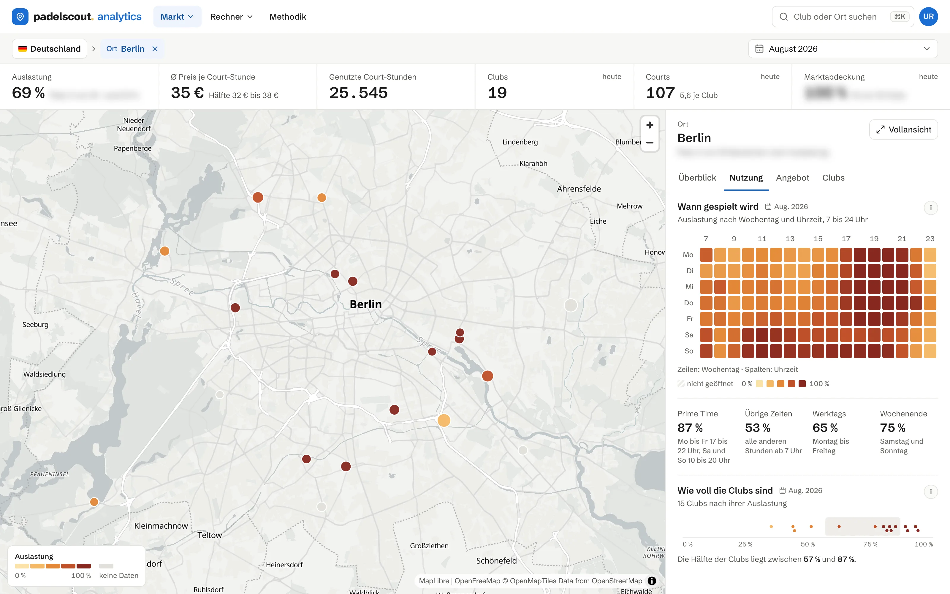
Club Reports
In both plansOne club, set against its peers.
One club in detail, month by month, based on its observed booking activity. Utilization and price sit next to the median of its comparable cohort.
- Revenue, utilization and price per court-hour for each month
- Peak hours by weekday and hour
- Utilization rank in the country and in the region
- Clubs nearby and market position from price and utilization
Underlying data: The comparable cohort is similar clubs, nearby first and wider where needed. Every tile explains how it is calculated.
This is what a club report looks like: the free sample shows a real Berlin club, without its name.
View the sample report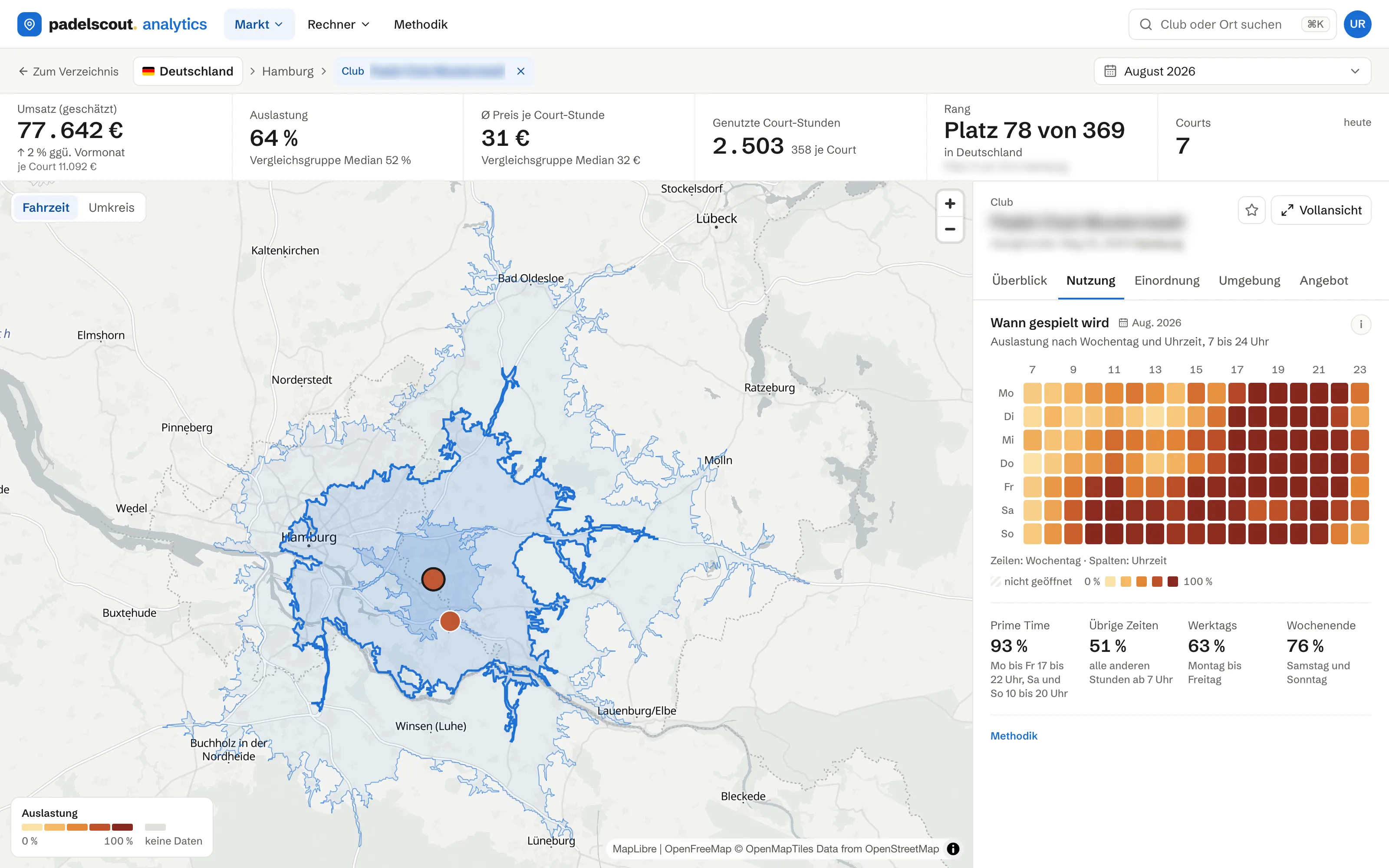
Profitability Calculator
Investor onlyFrom an idea to the investment decision.
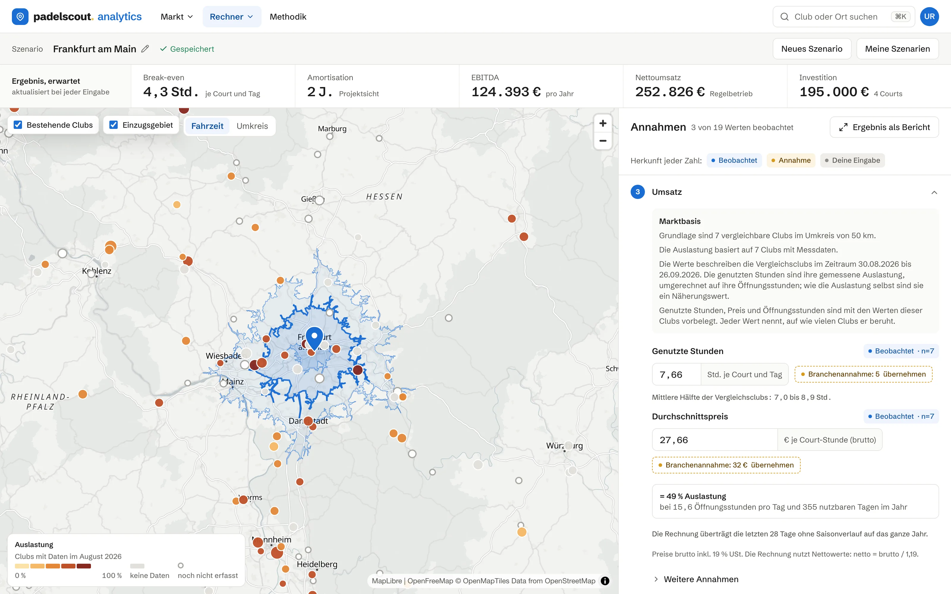
Drop a pin or search for a place. The map shows the existing clubs with their utilization and the drive-time area, and the calculator takes the court-hours in use and prices of comparable clubs nearby. Six steps add the facility, investment, financing and running costs, through to break-even, EBITDA and payback before tax. Scenarios can be saved and reopened.
- Map with existing clubs, drive-time areas and place search
- Hours in use per court per day, open hours and price from comparable clubs
- Five build types, costs per court, financing as an annuity
- Break-even in hours, EBITDA, payback and three scenarios, pre-tax
Underlying data: Hours in use, price and open hours come from observed data from comparable clubs; every cost line is a labeled assumption you can replace. When the peer group is thin, that is reported instead of smoothed over.
Padelscout Analytics launches soon.
Until then, the sample reports are open to everyone. Questions? info@padelscout.io